Our Portfolio
Take a look some examples of our recent work for clients in our professional portfolio.
01
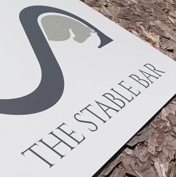
After an extensive refurbishment, the management team at The Stable Bar tasked us with creating a new brand to reflect the stylish and contemporary nature of the venue.
We used a palette of subtle colours and tones to compliment the new décor. This simple yet distinctive brand has been successfully used throughout the development from menus, staff workwear and signage.
> Brand Design
> Signage
> Website
02
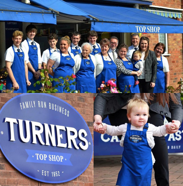
This long established family business were looking to re-brand their store following a refurbishment and expansion. The family were looking for a traditional style brand which could be used for external signage and also throughout the store and workwear.
We delivered all of the items on a tight timescale ready for the opening weekend which was a great success.
> Brand Design
> Signage
> Advertising
03
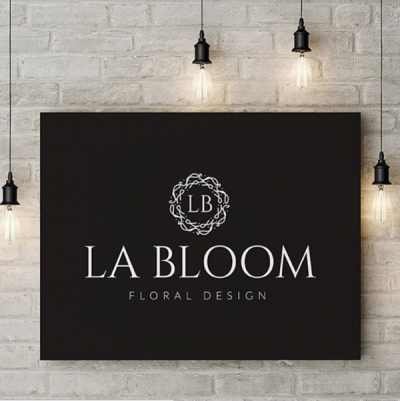
We were asked to help think of the brand for our clients new business. La Bloom fitted their business style and objectives perfectly, we then developed various branding concepts before finalising the design ready for the company to launch.
> Name Creation
> Brand Design
> Stationery Design
04
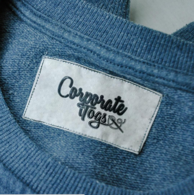
The owner of Corporate Togs wanted a new fresh look for the business and approached us to create a new brand to appear throughout on all of their marketing communications.
We developed a brand design that is clear and easily recognisable that look greats when incorporated into branded clothing.
> Brand Design
> Email Marketing
> Stationery Design
05
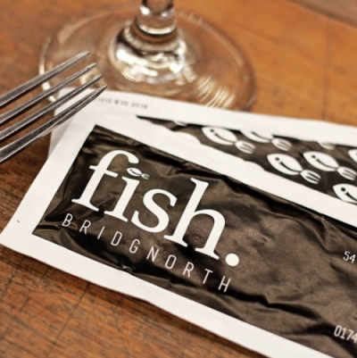
The owners at Fish were looking for a simple and stylish brand to launch their new fish mongers and oyster bar. The brand had to be suitable to work on a variety of applications and be clearly identifiable on a busy High Street. Since the initial design, the logo has been used on staff workwear, signage, menus and business cards to provide a consistent feel to the shop.
> Branding Design
> Signage
> Promotional Material
06
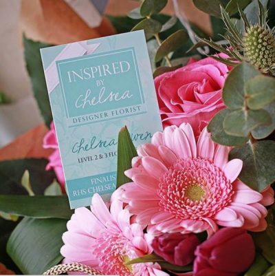
When Chelsea started her business she wanted a professional brand to launch her stores. We worked to create a brand that would differentiate her business from the competition, which could also be used on a variety of marketing materials.
The classic minty blue brand colours now decorate the exterior of the store providing a bright and friendly welcome and her branding used on every product.
> Brand Design
> Stationery Design
> In-Store Merchandise
07
The team at Skan 4 x 4 were looking to evolve their brand name for their expanding business. They wanted the new logo to portray a strong automotive look and a professional image. The new logo also had to be suitable to work throughout the business both on and offline.
> Branding Design
> Social Media
08
When Chelsea started her business she wanted a professional brand to launch her stores. We worked to create a brand that would differentiate her business from the competition, which could also be used on a variety of marketing materials.
The classic minty blue brand colours now decorate the exterior of the store providing a bright and friendly welcome and her branding used on every product.
> Brand Design
> Stationery Design
> In-Store Merchandise
If you have any questions about our promotional items service and how we can work with your business please get in touch 0845 0049 557. We produce all of our design work from our studio in Bridgnorth, so if you would prefer to pop in to see us please email hello@promofix.com to arrange an appointment.

